Reports
Visualize data effectively with a rich reporting interface that supports a wide range of chart types—including bar, line, pie, table, gauge, heatmap, sankey, and more. Preview reports in real time, apply conditional data visibility, and personalize visual output with customizable color palettes and chart settings to match your analytical and branding needs.
- Preview Reports : Users get the “Preview” option to get a condensed, interactive, or
visual snapshot of the full report — designed to help users quickly understand the content
before committing to reading the full document. It helps the user to have a look at changes
made according to their choices or filters applied before preparing the complete report.
Also, users can preview the prepared data every time after they apply any filter as the
“Preview” option is available at the bottom of every filter.
Figure 1. Figure - Preview Button with Eye Icon at top of Report Creation Page 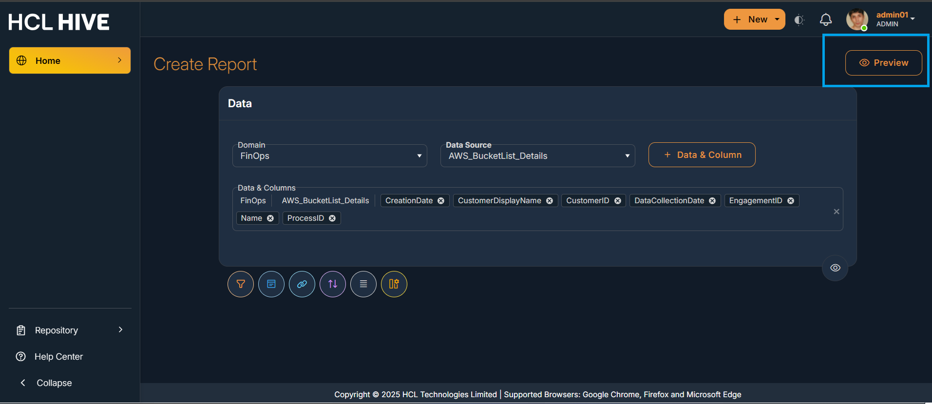
Figure 2. Figure - Report Preview 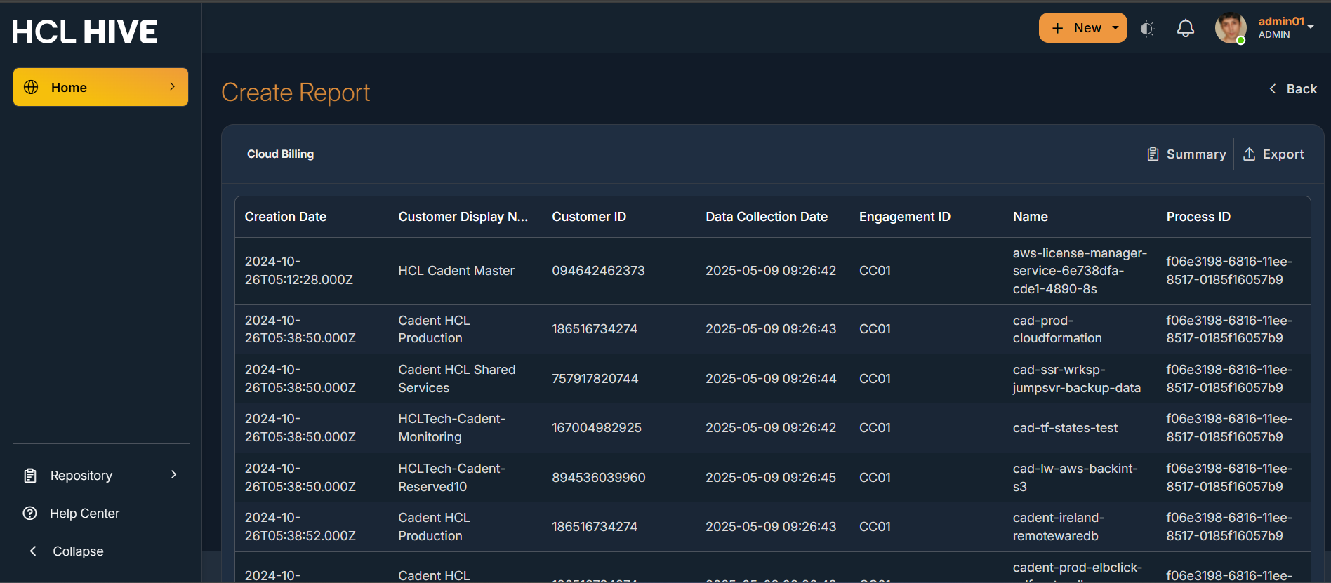
Figure 3. Figure -Report Preview with the Toggle button to convert the preview data into Chart form 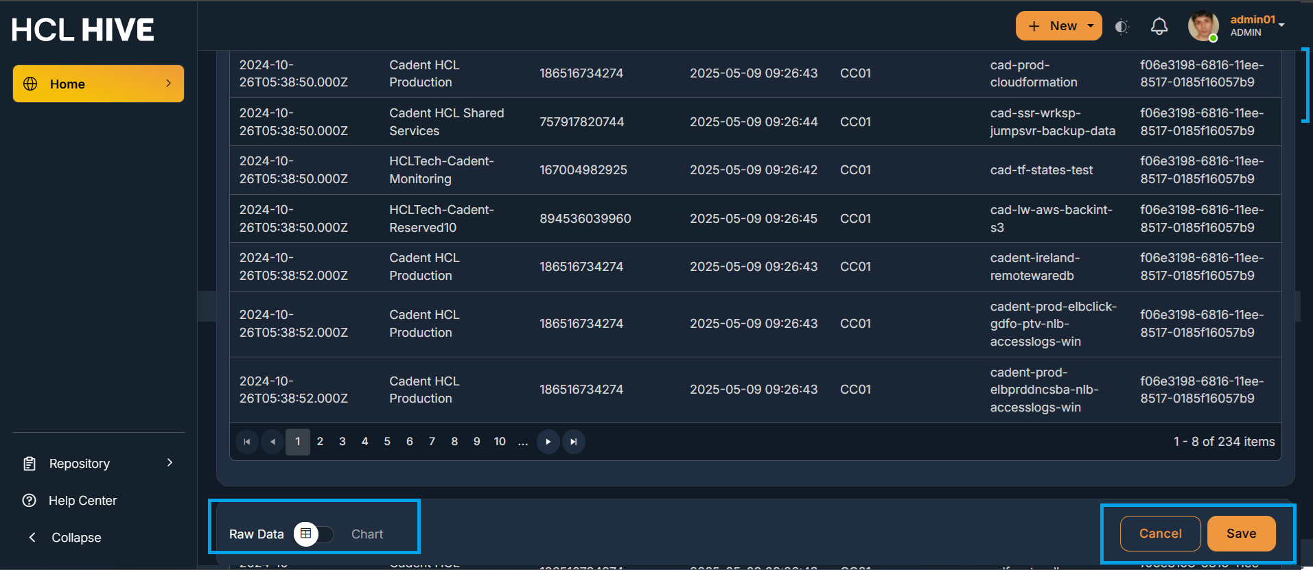
Figure 4. Figure - Preview Icon after each filter 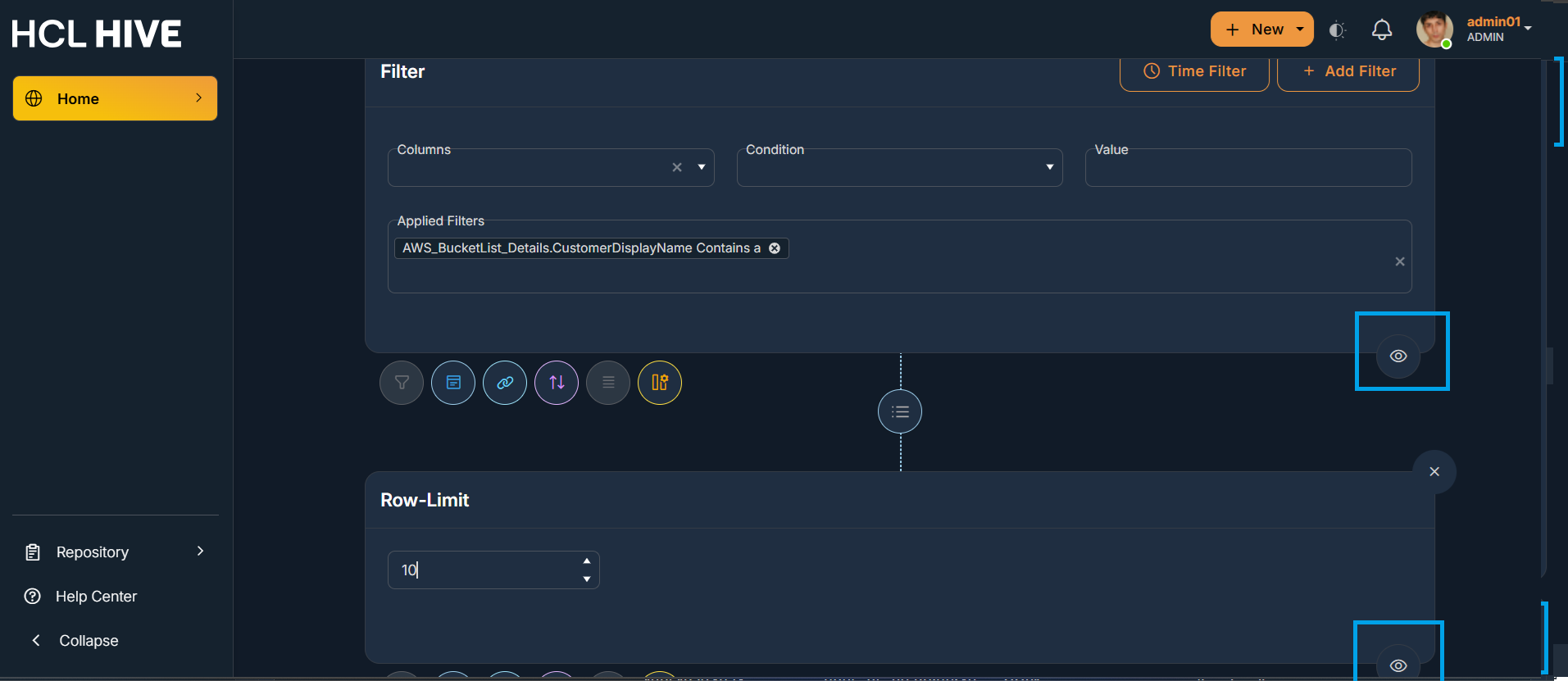
- Chart Types : It supports different chart types like bar, line, pie, row, area, tile,
table, gauge, spline, stackbar, tree, graph, sankey, map . Users have an option to change
the preview data of the report in any of these available different chart forms.
Figure 5. Figure - Chart Types 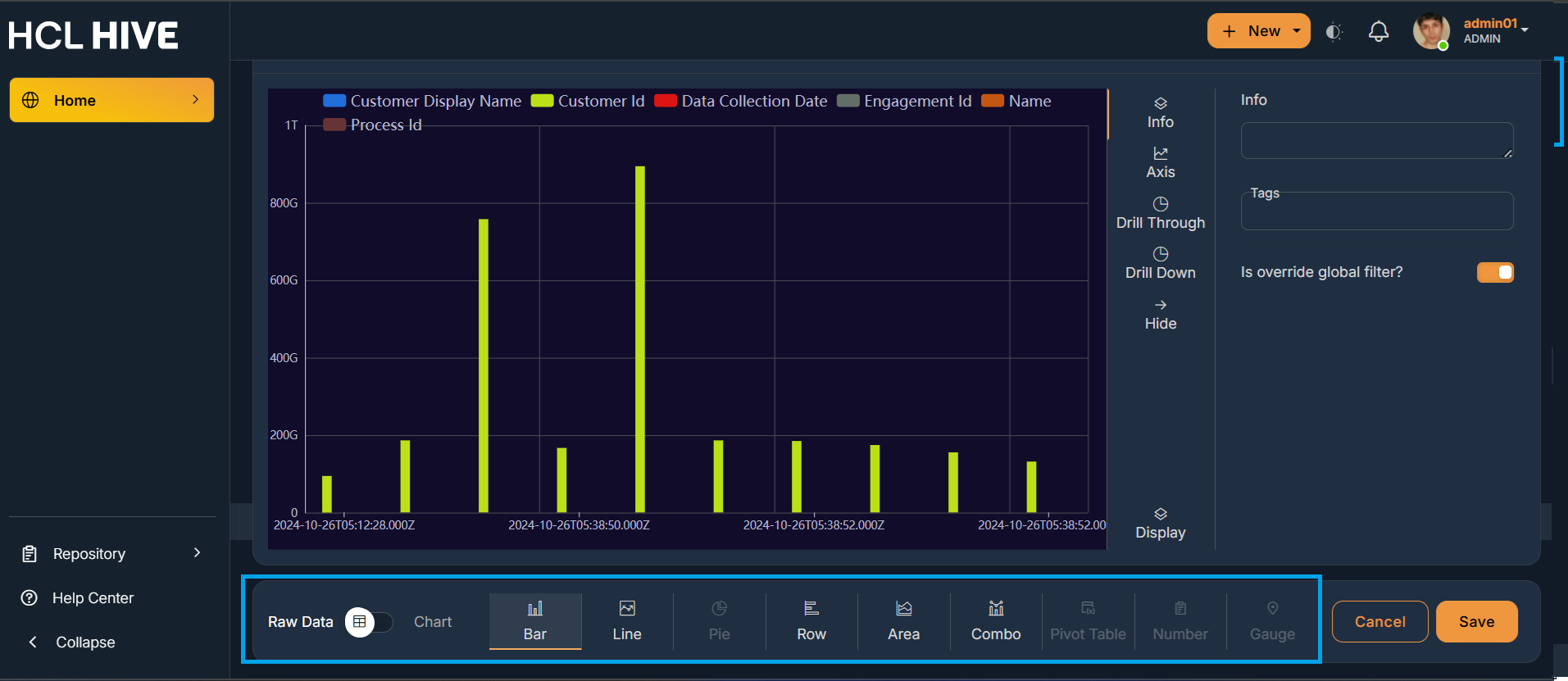
Figure 6. Figure - Chart Types 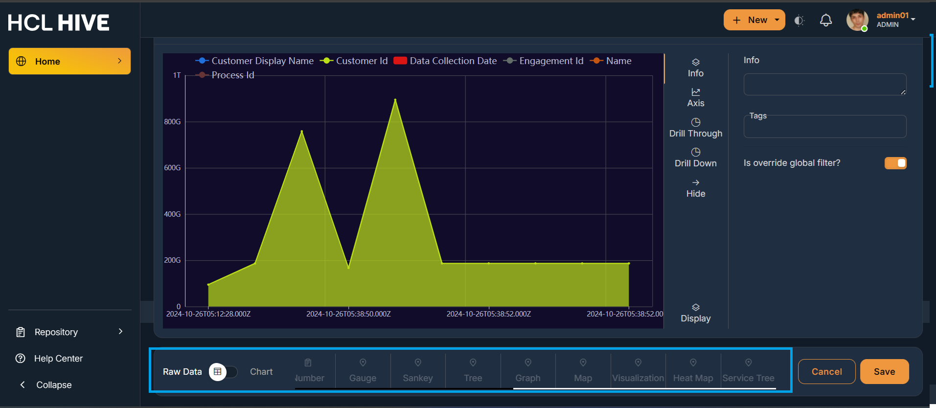
- Users can either save the form they have chosen for a chart or Cancel the changes using
the “Cancel” and “Save” button.
Figure 7. Figure - Cancel and Save Button 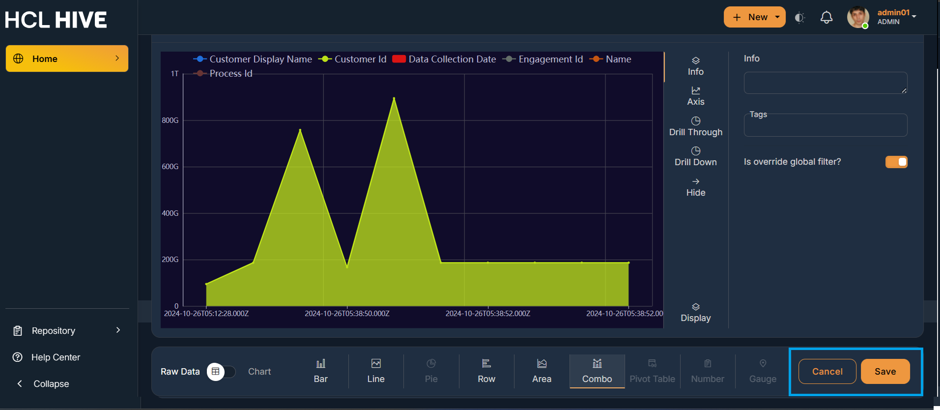
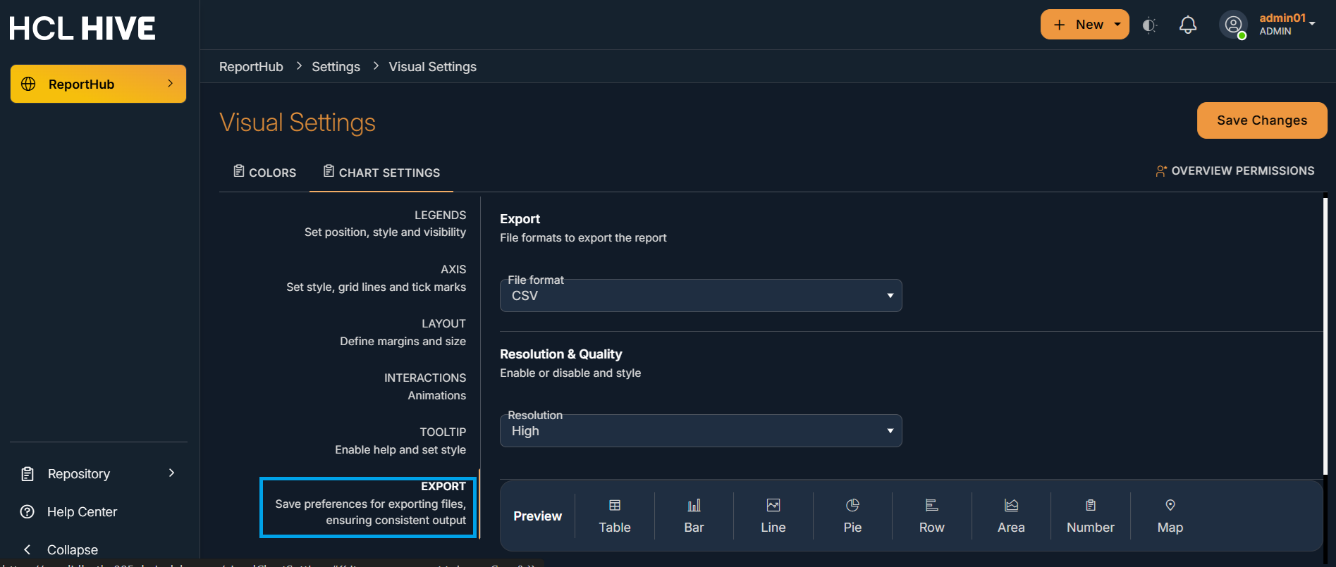
- Customizable color palettes : It helps the users to choose and control the colors used in
various parts of your report for both visual appeal and functional clarity. Users can click
on Settings from the profile menu and then on Visual Settings. Further users can choose the
colors , make their custom theme and further make it as default. It allows the users to
select up to 4 color palettes from the settings and the same is visible while creating a
report in the query builder.
Figure 8. Figure - Settings from Account Drawer 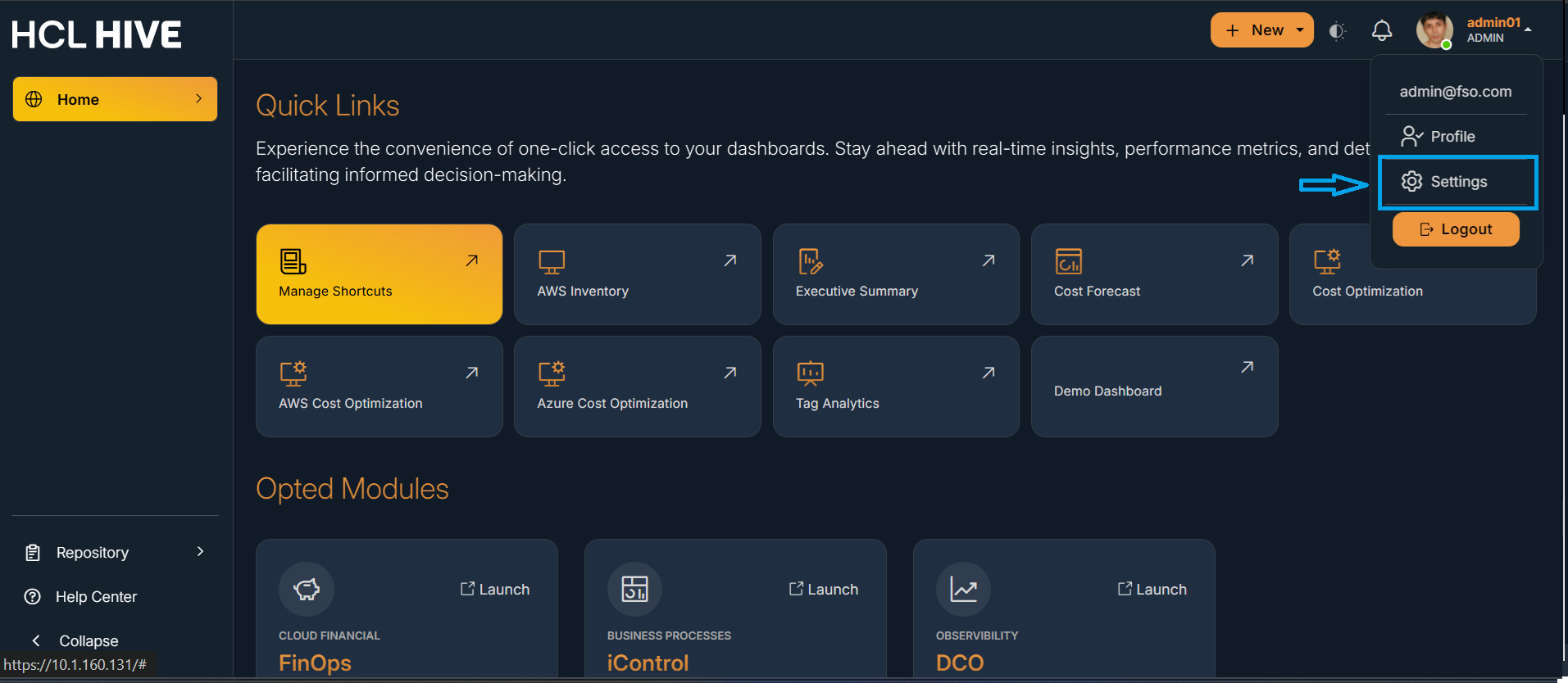
Figure 9. Figure - Chart/Colour Settings 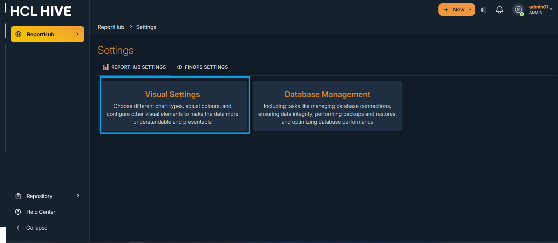
Figure 10. Figure - Customizable color palettes 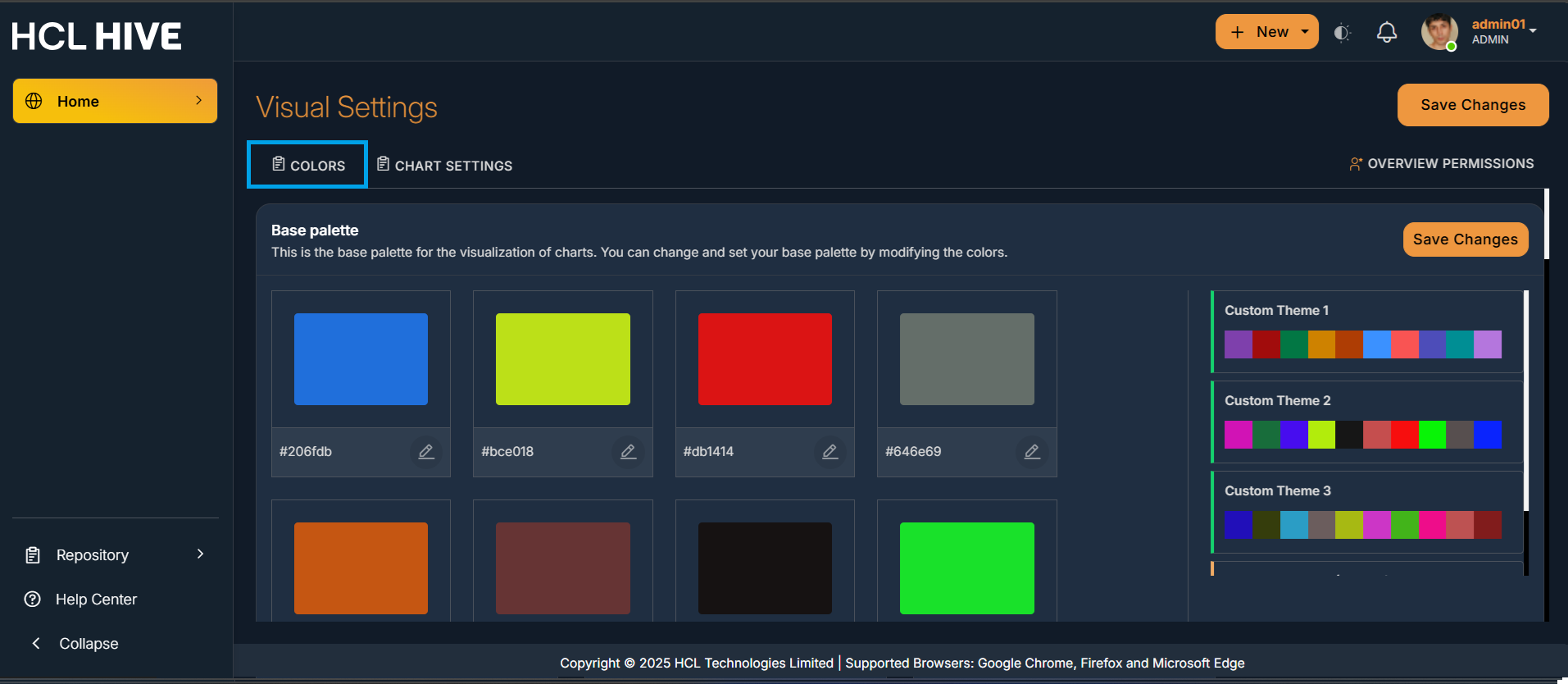
Figure 11. Figure - Customizable color palettes 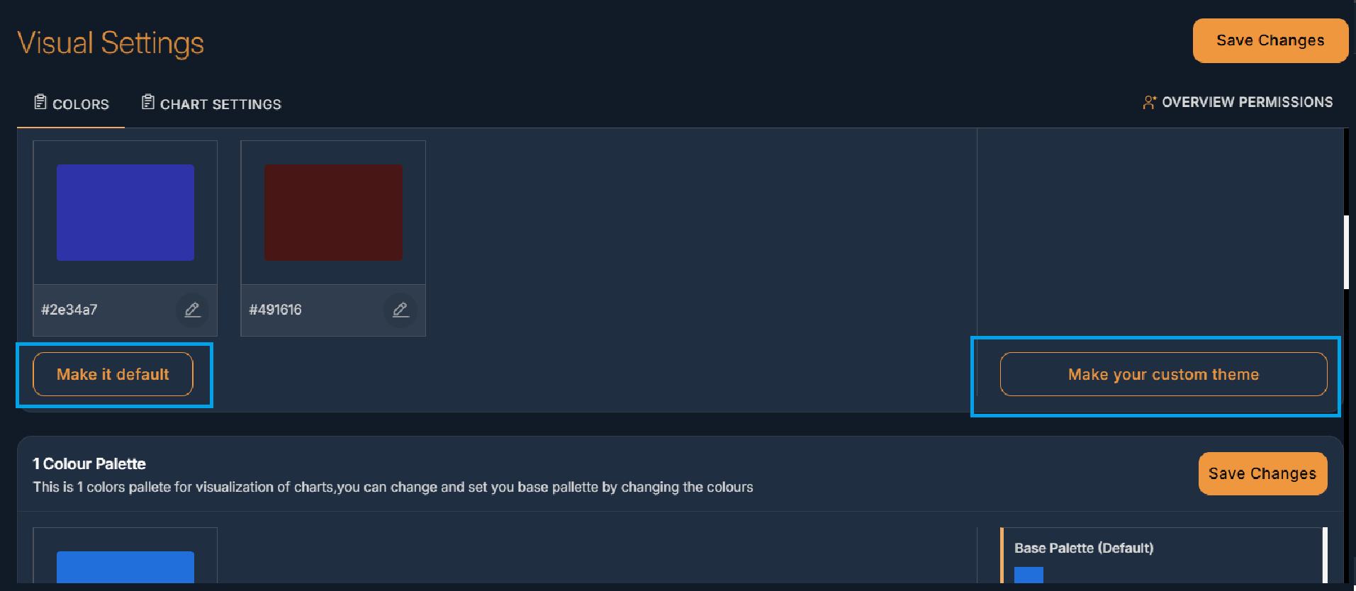
- Customizable Chart Settings : It refers to the ability to change how a chart looks,
behaves, and presents data according to your needs or preferences. Users can control how a
chart appears and works. Instead of using default settings, users modify things like:
Legends , Labels , Axis ranges , Layouts, Data display style , Interactions (tooltips, zoom,
filters). This can be done in the similar way as customizing color palette i.e. by clicking
on Settings from the account drawer and then on Chart Settings.
Figure 12. Figure - Customizable chart settings 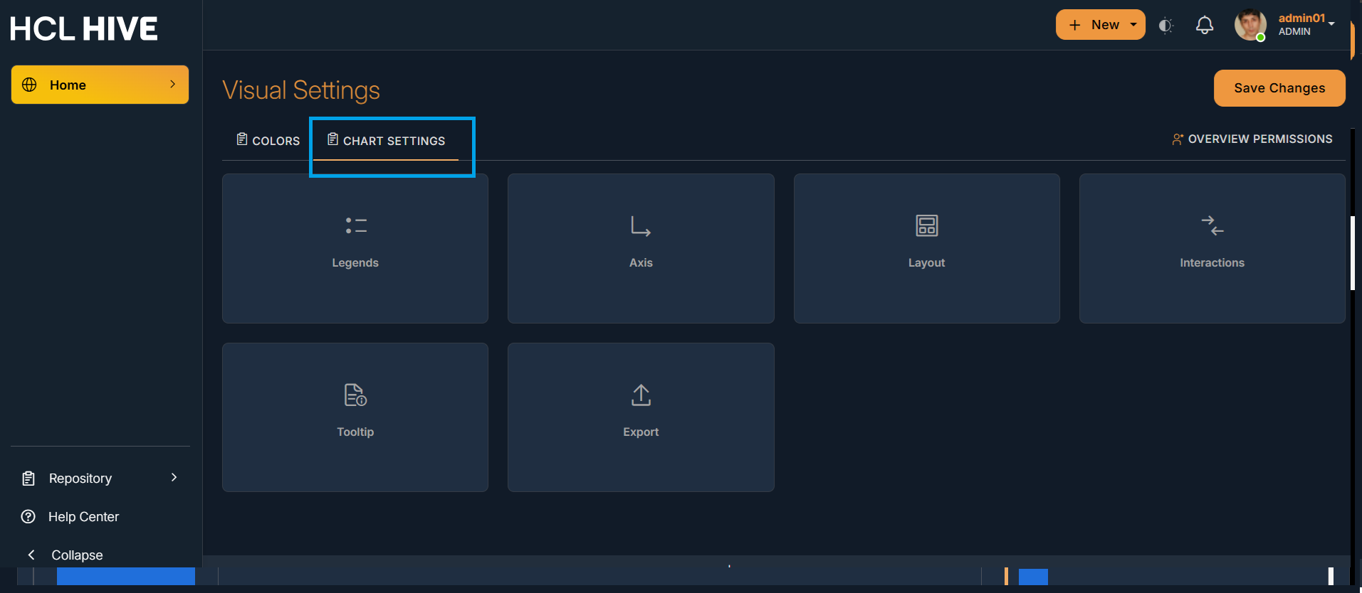
Figure 13. Figure - Customizable Legends 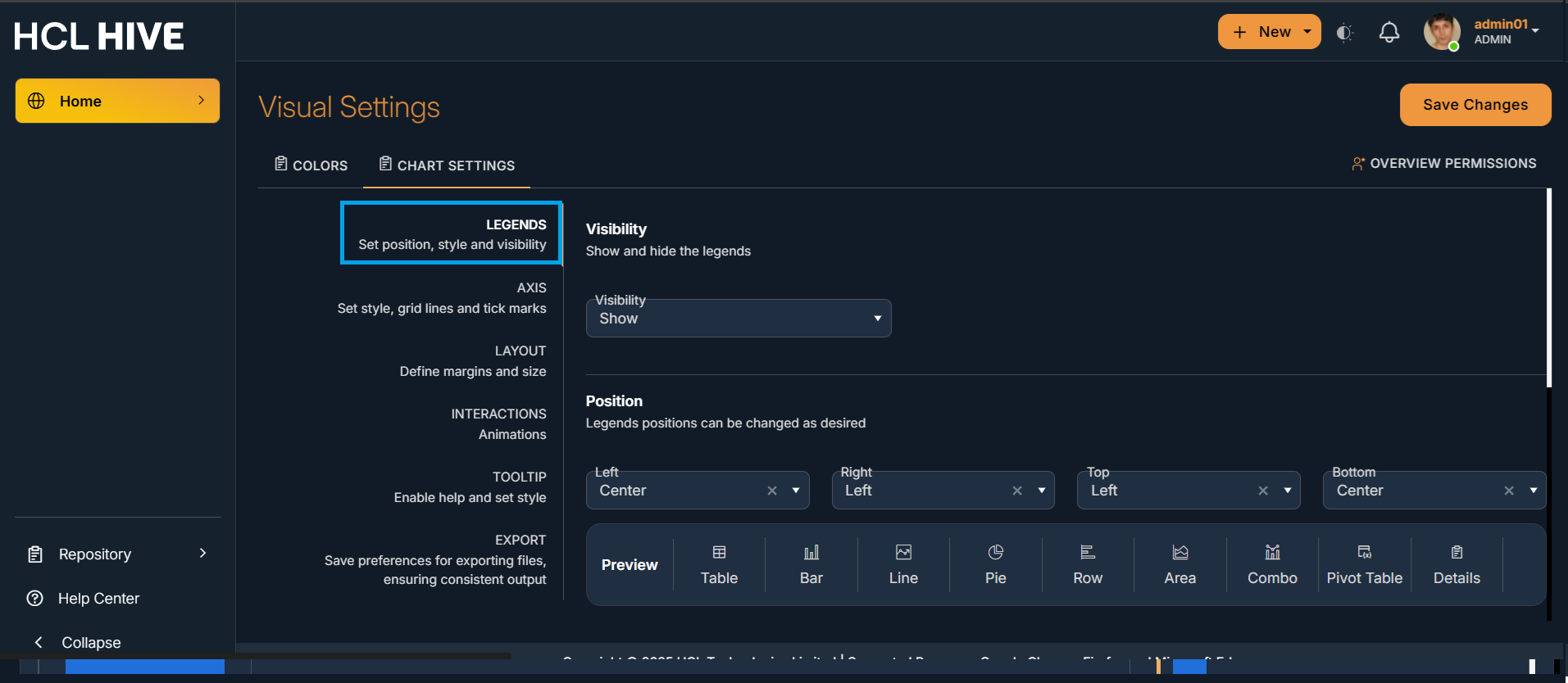
Figure 14. Figure - Customizable Axis 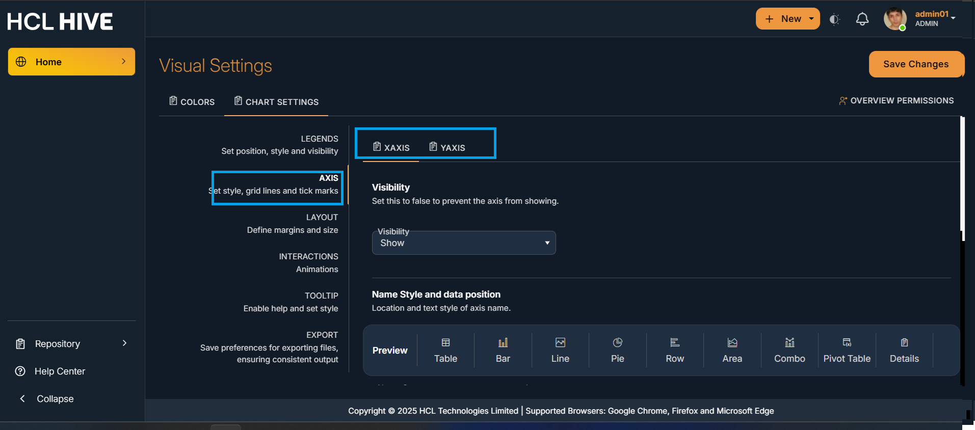
Figure 15. Figure - Customizable Layout 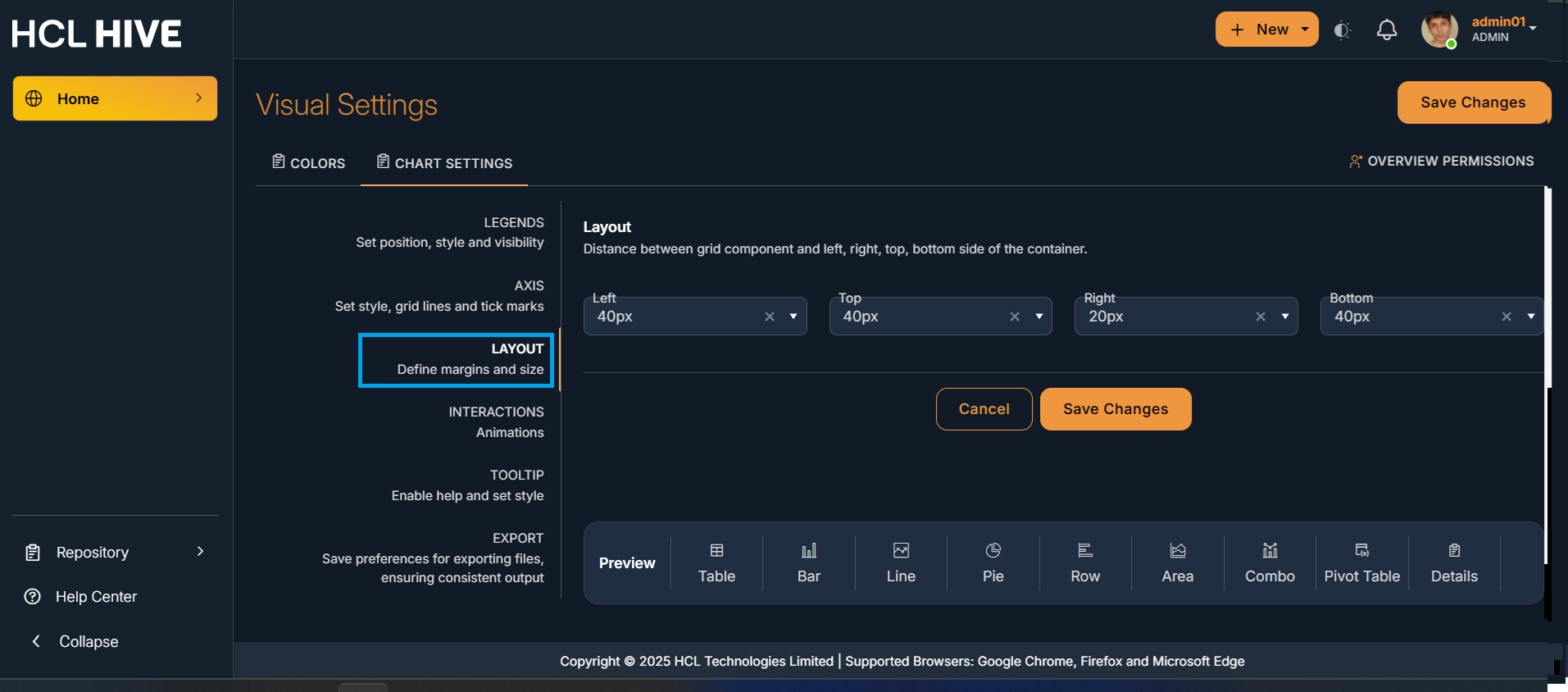
Figure 16. Figure - Customizable Interactions 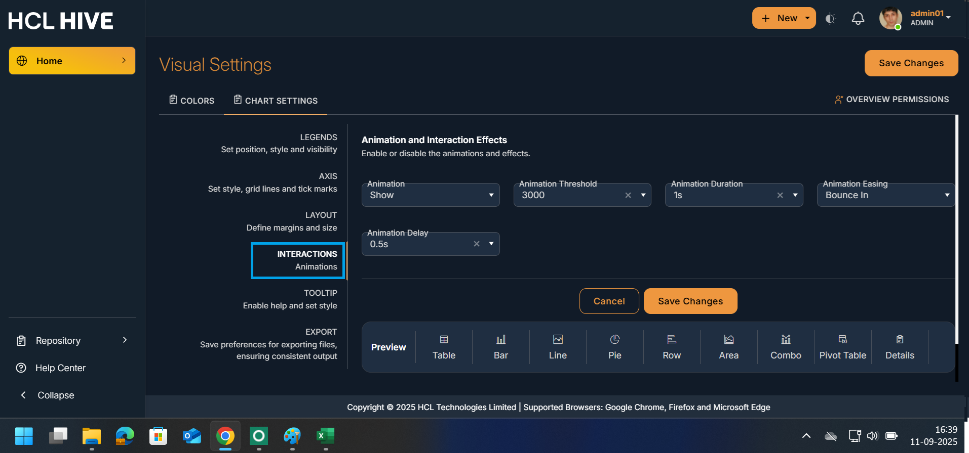
Figure 17. Figure - Customizable Tooltip 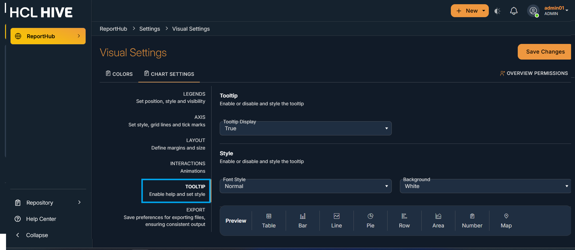
Figure 18. Figure - Exporting Files