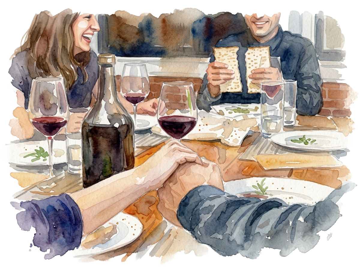
Four questions worth asking at any seder
You don't need to know the order of things to ask a good question. That's kind of the point.
Read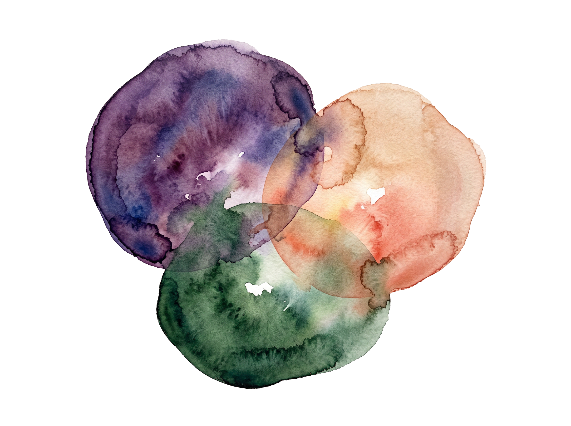
A garden in daylight: open space, and soft color that grows from the land the tradition came from. This concept is clear and modern first, with warmth carried by watercolor, rounded forms, and the glow of a candle.
What a style concept is: the look and feel of Jewish Wisdom. Its colors, type, shapes, imagery, and voice, and how they work together to create a mood.
What it isn't: a page design. The layouts here show elements “in situation” to convey that mood; real pages will be designed around their own content.
“Flourish” is the selected concept, and the foundation for the full brand and style guide.
Sample copy draws on the approved Core Marketing Messages and our conversations.
Rubik leads: headlines, Hebrew, buttons, and navigation. Crimson Pro reads: body text, descriptions, and quotes, bringing warmth and a little seriousness to longer passages. Both are free Google Fonts, supported natively in Wix Studio, and each loads as one variable file plus a second for its italic.
The Torah names seven foods of the land: wheat, barley, grapes, figs, pomegranates, olives, and dates. This palette borrows their colors, softened for a bright, open screen. Each color carries a meaning, and the meaning decides its job. Fig leads; there's no blue and white anywhere.
Daylight and room to breathe. The open morning garden, where nothing is demanded of you. The page itself.
Rootedness and endurance. Olive trees live for thousands of years; a tradition that stays alive. The steady voice of all text.
Invitation and home. “Under their vine and under their fig tree” (Micah 4:4): welcome and a place to sit together. It carries the ask: buttons, links, the next step, and the glow that gives containers depth.
Light and beginnings. The candle flame, the Shabbat glow, the first light of morning. Warmth you move toward: it glows behind buttons, never becomes text.
Peace and renewal. The leaf the dove brought back to Noah: hope after hardship. Washes, tags, and moments of welcome.
Nourishment. Bread, challah, the harvest of Shavuot, everyday practice. Hebrew pins and citations: small, nourishing bits of learning.
Every text pairing shown clears the 4.5 : 1 accessibility standard for body text. Olive Leaf is for shapes and large type only.
The following design placements are for illustration purposes only and are not the homepage design. They show a mix of elements “in situation” to convey how these elements complement each other to create a mood.
Ask about Shabbat, a holiday, or whatever's on your mind.
Answers draw on the Library and our community partners, with sources linked. Names and contact details are removed before anything is saved.
Illustrative only. Layout follows Section 4.1 of the build specification; final copy is set with the style guide.
In this concept, Hebrew script can also be decorative, as on the cover and the homepage columns. Wherever it appears in content, it comes with its transliteration and meaning, set in a soft pill so it reads as a friendly marker rather than a test, with a short note right beneath it. Quotes from traditional texts show the Hebrew above the English, and the citation comes with a short note shown right beneath it.
One answer sits at the center, under an arch, where the eye lands first. Other ways people have done it run down one side; sources and a path to real people run down the other. It reflects what we heard during our discussions: start with one way, and show that there are others.
Some families light a little early on busy nights.
Others light wherever they are, even a single candle in a hotel room.
Some wait and light together when everyone's home, so the moment is shared.
“Do I need to wait for sundown to light Hanukkah candles? I'll be on a plane.”
Classically, candles are lit after dark, because the Jewish day begins at night. If that won't work this year, light them when you can. Lighting a little early is far better than not lighting at all, and you won't break anything. Wherever you land, you'll be bringing a little light with you.
Ask a follow-upTwo small groups near you are gathering for Hanukkah.
Find a Small GroupSample answer for illustration. Sources and small groups are placeholders.
Real people, together. Instead of one filter for every photo, each photo keeps its own light, whether candlelit or bright daylight. A gentle color harmony ties them into one family, and soft masks give pages variety and a clear focal point.

Photos and videos sit in soft shapes rather than hard rectangles, using Wix's built-in masks. Mixing shapes keeps a page lively. A watercolor wash underneath marks one photo as the primary: the feature at the top, with a gallery of smaller shapes below it.
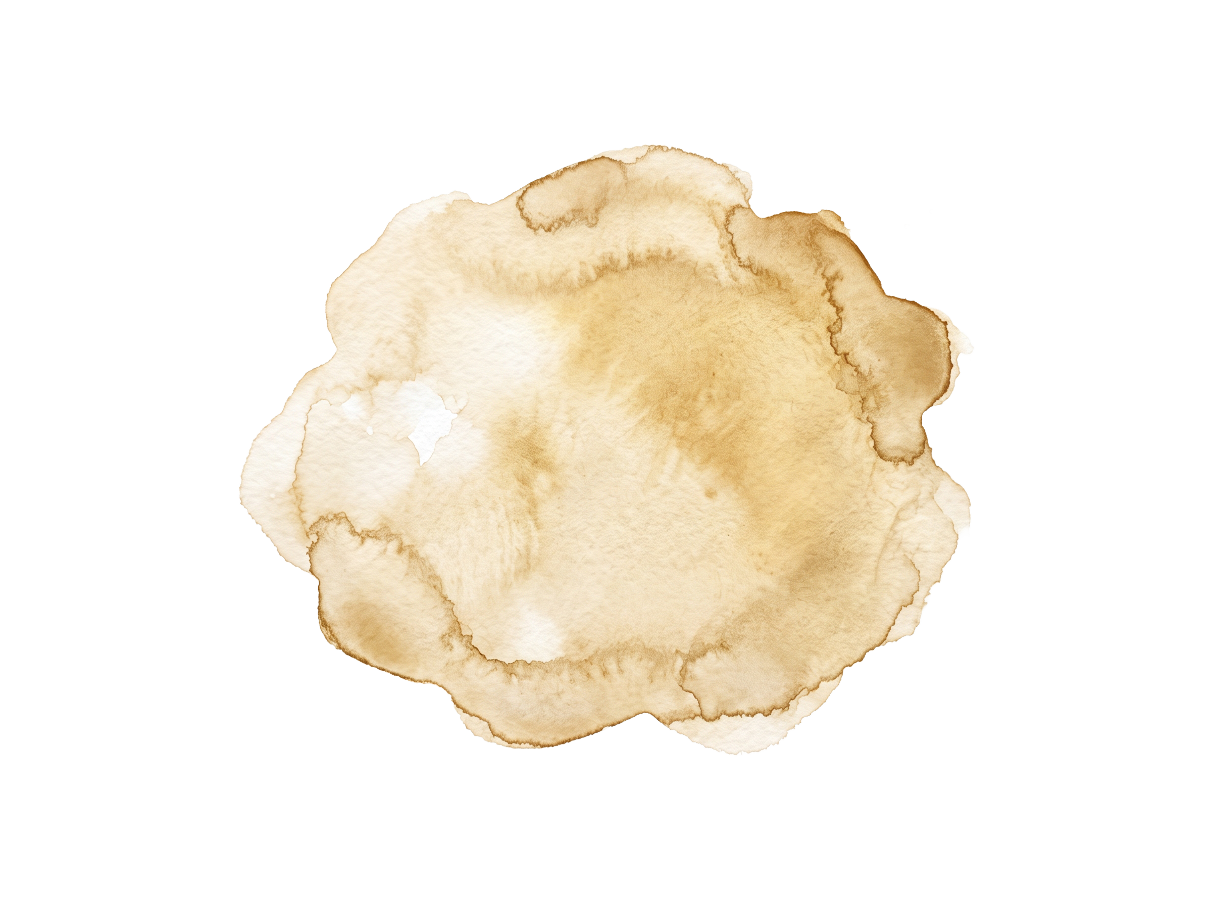
The featured photo sits in an arch over a wheat wash. Everything below it uses smaller shapes without a wash.

One primary per view. Only the featured photo gets a wash beneath it; use the wash that matches the page's category.
Two or three shapes per page. Variety, not a sampler. Repeat shapes within a gallery so it feels deliberate.
Faces stay clear of edges. Choose the mask after the crop, so no one is cut off by a curve.
Video too. The same masks apply to video in Wix; the featured video can sit in the arch with a wash behind it.
Photo example.
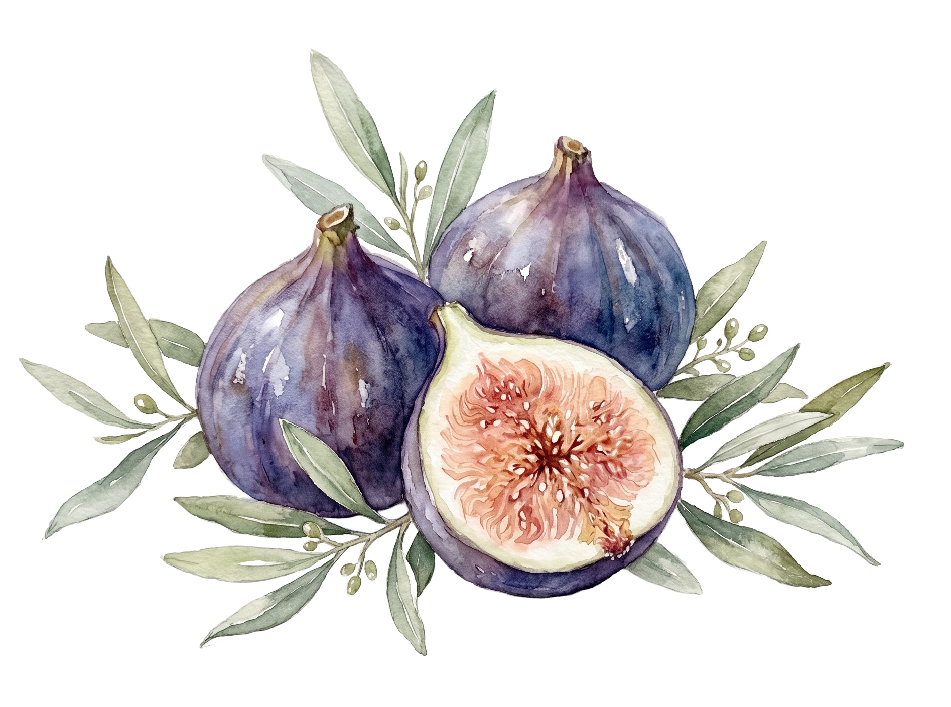
Where a photo can't do the job, such as an idea, a holiday, or a Library header, illustrations are painted in shaded watercolor: soft light-to-dark modeling that gives each form weight, darker pigment pooling at the edges, loose deckled borders, and highlights left as bare paper. Subjects range from the garden to people gathered at the table, and the palette stays close to the seven species.
Keep line work minimal. If a line is needed, use a thin, broken brush line in Evergreen.
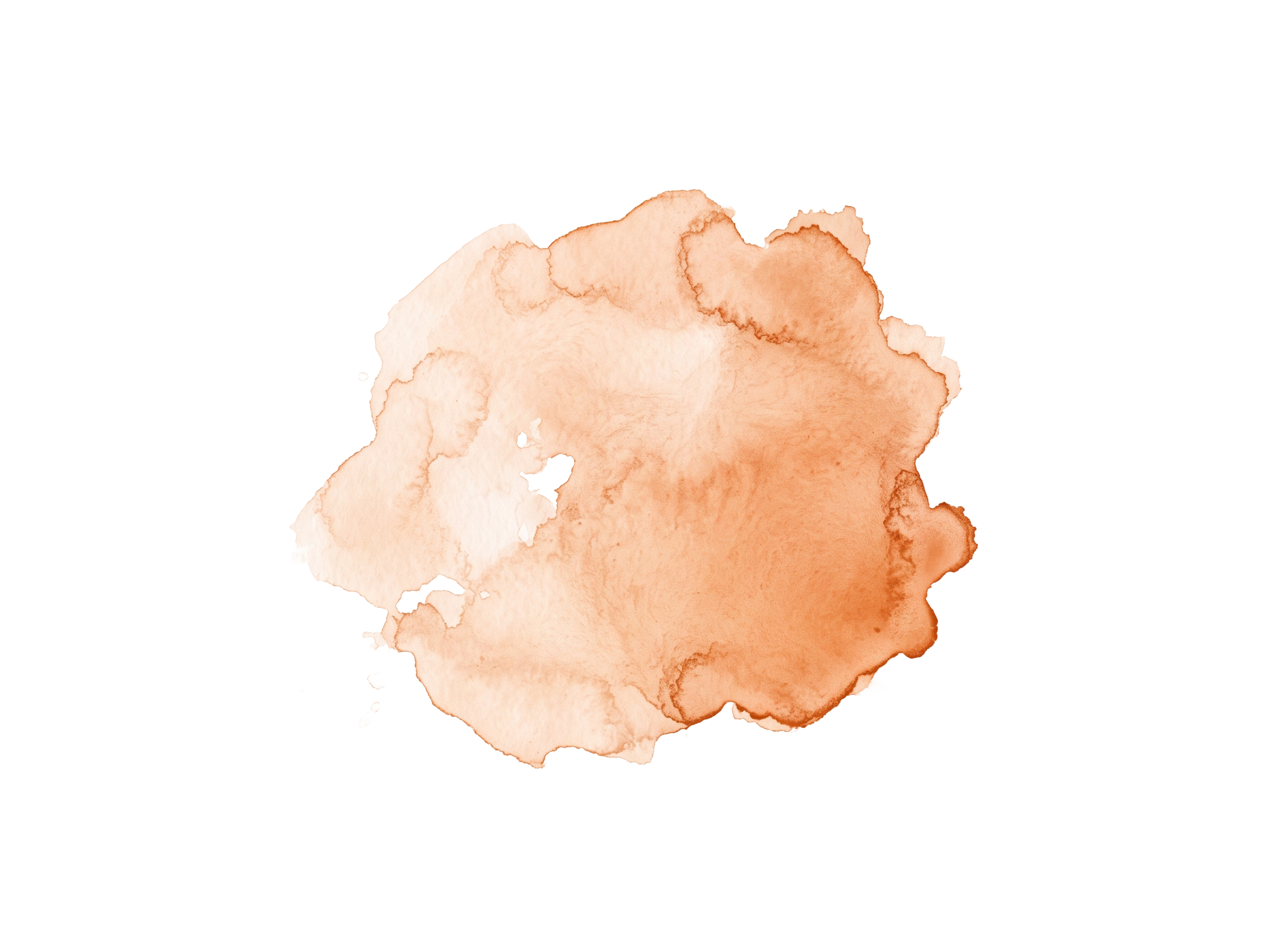
Watercolor washes, one per palette color, used behind headings, category columns, and social posts.
The same rounded forms, seven-species color, and watercolor carry from a Library card to an Instagram post to a newsletter, so every touchpoint is recognizably Jewish Wisdom.
You don't need to know the order of things to ask a good question. That's kind of the point.
Read
חסד Chesed, loving-kindness
That feeling when you do something good, quietly. It has a name.
Jewish WisdomYou are not a productivity machine that needs occasional maintenance. There's an ancient, surprisingly doable practice that's known this all along.
Try it for an hourFind a small group run by our community partners, meeting in homes, parks, and online. Start with your zip code to see what's near you.
Photo example, with the “Flourish” harmony and a seed-shaped frame.